Kickstart Training
Getting Started
Actions
Working with Dates
Form Designer
Tabs and Tab Permissions
Views and View Customization
Advanced Column Permissions
Associated Items
Print Formatting
Charts, Filters and Other Web Parts
Stacked Chart
Connected Fields
List Search
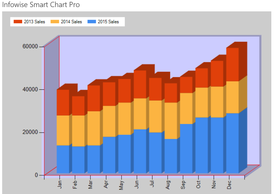
Stacked Charts are useful for showing data that is combined together to give a total. In the below example, the total sales for each month is stacked to that a grand total can be seen for each month.

Instructions
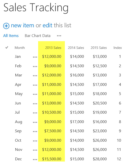
- Edit the list used for the Column Chart to include an additional field 2013 Sales.
- Enter in some more test data as shown:

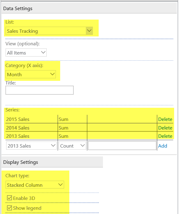
- Create a new chart web part and apply the settings as shown:

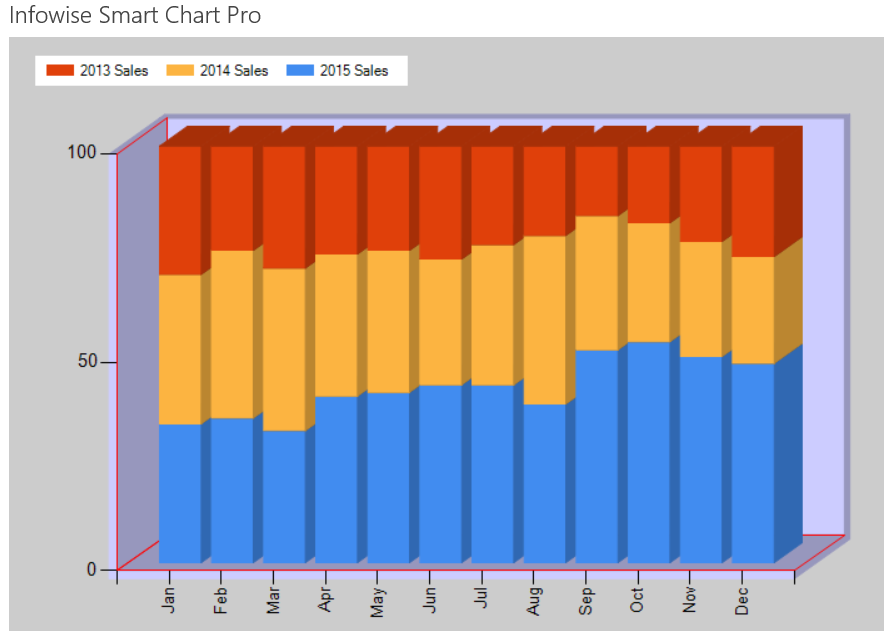
- Next try adjusting the Chart Type to Stacked Column 100%.
- This version of the chart compares the values demonstrating which set of data has a larger distribution:

Summary
Stacked Charts can be used to show the total of data that are in a logical group. These charts are more sophisticated than Column or Bar Charts. Consider using this type of chart when the amout for two or more fields is often totaled together.
Last modified: 4/29/2025 8:58 PM
Loading...
Add your comment
Comments are not meant for support. If you experiencing an issue, please open a support request.
Reply to: from