Hi,
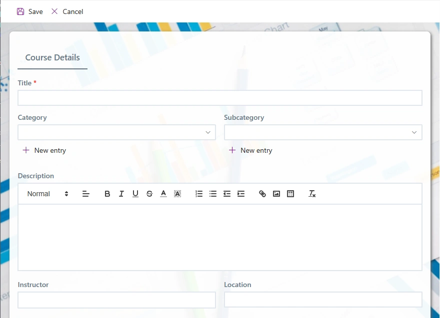
Since the initial release of Modern forms a few years ago, we made sure the forms look and work great on any device, from a giant desktop screen, down to the smallest cellphone. Our forms are responsive by design and automatically adjust their size and even layout to accomodate the current screen real estate. Our customers use the same forms both at the office and on the go, without any need for adjustments.
Up until now, we only allowed column labels to be placed above the columns, as it's the most logical layout for responsive forms and it's the general tendency in all modern forms everywhere.

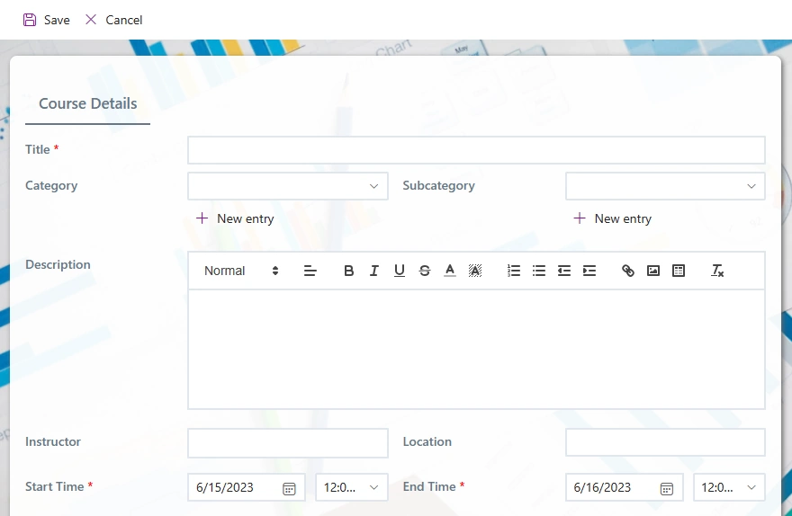
But we also received multiple requests to allow placing labels beside the columns. Classic forms used this layouts and I guess old habits refuse to die. Although it was possible to imitate that placement with Containers and Fragments, it wasn't the best solution, as various rules and permissions had to be applied separately to labels and columns, adding work and complexity.
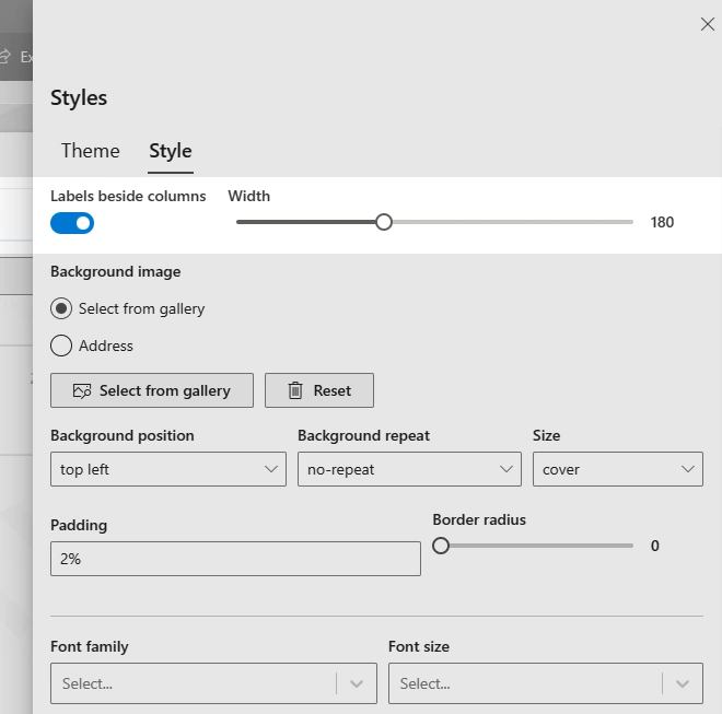
We are now adding support for side-by-side labels, as simple as a single toggle. In Form Designer, click on Styles in the toolbar, then switch to Style tab. Here at the top you can see the new option.

As you can see, once you activate the new mode, you can also specify how wide the labels should be, just adjust it according to your actual forms labels. And while you are here, take a look at the other styling and theming options, which will help you create amazing looking forms in no time!
Once you publish your form, you can immediately see the result:

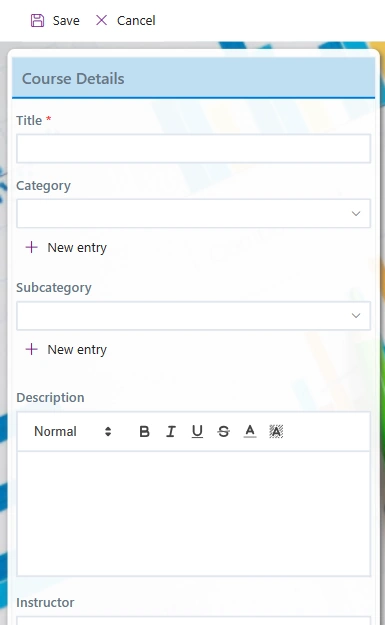
As easy as it should be! And when you view the same form on a very small screen (below 480px width, such as on a cellphone), the form will automatically adjust itself and place the labels above, as well as replacing tabs with expanding sections (accordions), to make the form much simpler to use.

Another feature you can leverage now, enjoy!
