Hi,
We got requests from customers to make validation errors on forms more prominent. Up until now, if you had a validation error on a tab, we would add a red asterisk to the tab name. Customers felt that it was too easy to overlook, especially with larger forms. The Save button would then not work and it would take time to figure out what was going on.
We added a more prominent error sign to the tab name and also a validation summary box under form, listing tab and column names with validation errors, like so: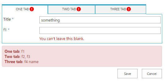
Hope it helps make forms more user-friendly, just re-save the tab settings to get the latest version.
The change applies to O365 customers only, on-prem customer already received a similar update in one of the latest versions.
Loading...
Add your comment
Comments are not meant for support. If you experiencing an issue, please open a support request.
Reply to: from
Flexible Forms
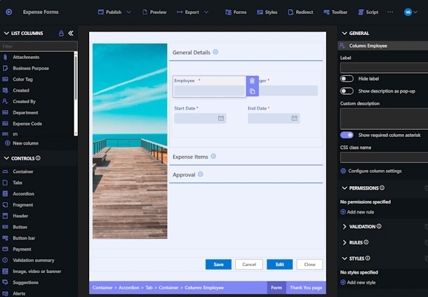
Convenient responsive modern forms, featuring tabs, section and column permissions, dynamic rules, repeating sections, electronic signatures and input validation, while keeping all your data safely inside SharePoint
Intuitive Automation
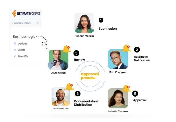
Replace complex SharePoint and Power Automate workflows with simple, but versatile Actions to create and update data inside SharePoint and in a variety of integrated applications, such as Exchange, MS SQL, Teams and many more

Clear Reporting
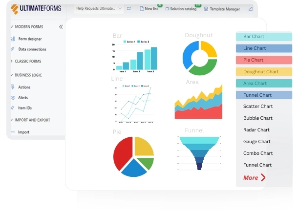
Present data as actionable insights with detailed shareable reports, dashboards, KPIs, calendars and charts
100’s of Templates
Easily create, replicate and distribute forms and automation-enhanced SharePoint business solutions, selecting from our vast free library and creating your own custom templates in Infowise UltimateForms


Dive deeper
Watch a short introductory video showcasing the different unique capabilities of UltimateForms.
