If you’ve already started using the new Form designer with your Modern experience SharePoint sites, you’ve also probably noticed that there are some big changes in how you work with your list and form information.
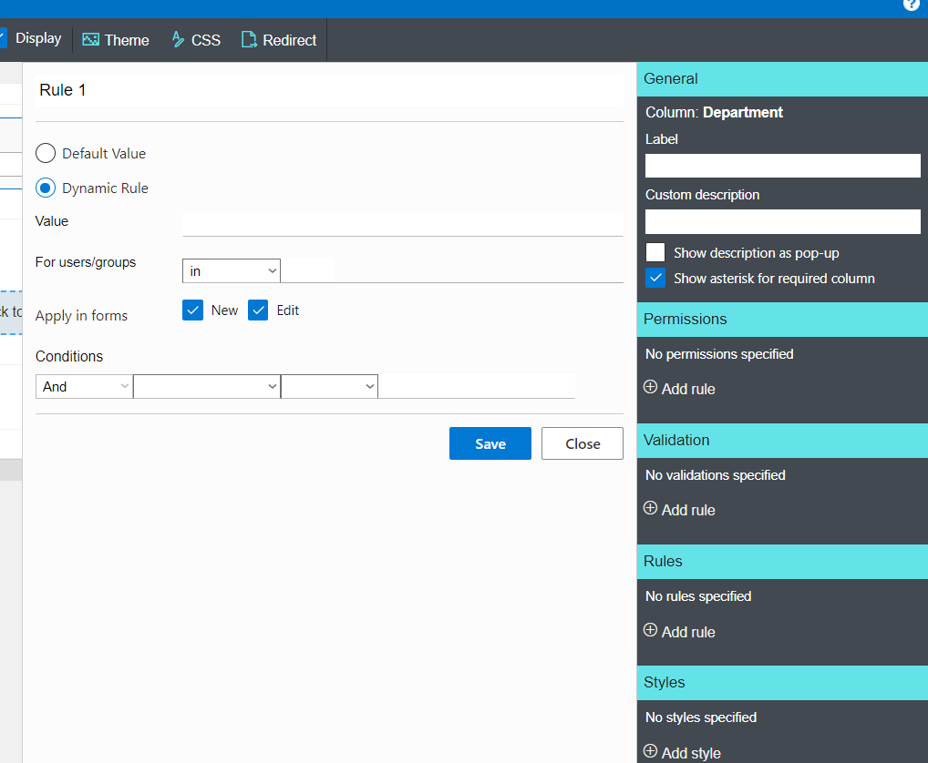
When you use the older style tab form builder, you get a nice-looking form, sure. And, you’ve always had the ability to do more advanced work with the list data by adding validation to column fields, or manipulating view or column permissions. You could even add dynamic rules and create default values for your form to ease the users’ jobs.
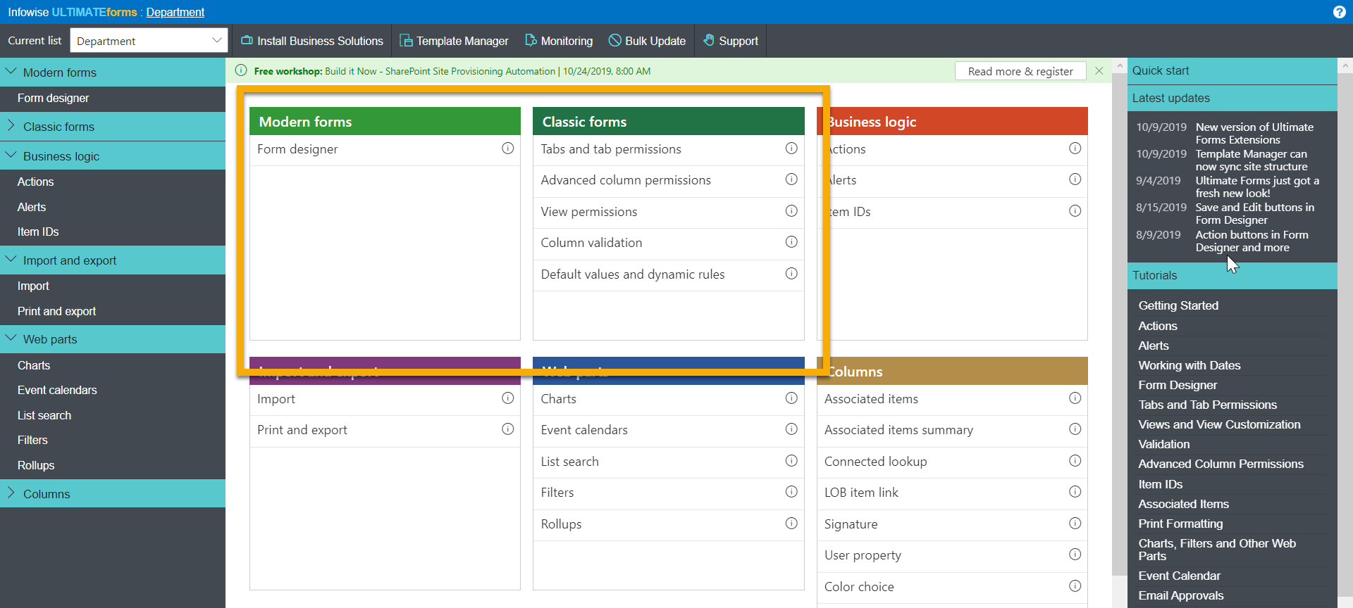
These choices are all still available to you – they’re listed as features under “Classic forms” on the new interface.

But the new Form designer doesn’t have these features listed. Oh, dear, what shall we do?
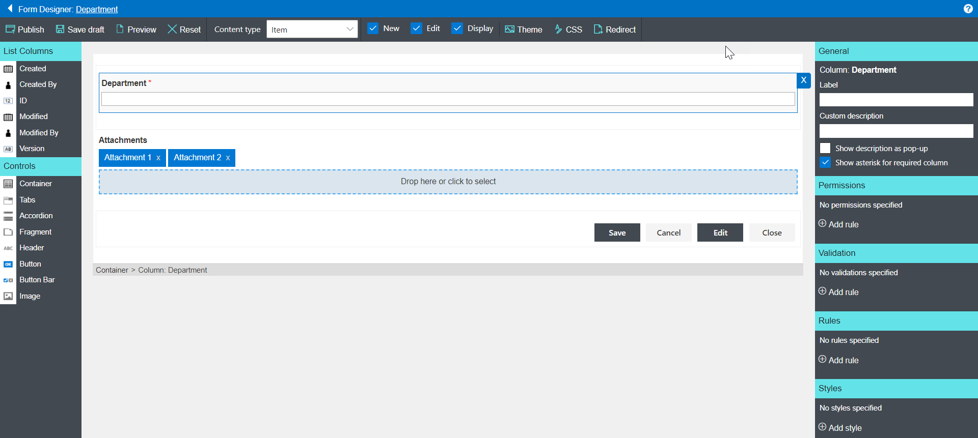
Well, how about going into a new Form and looking – because all those features now exist within the Form designer itself!

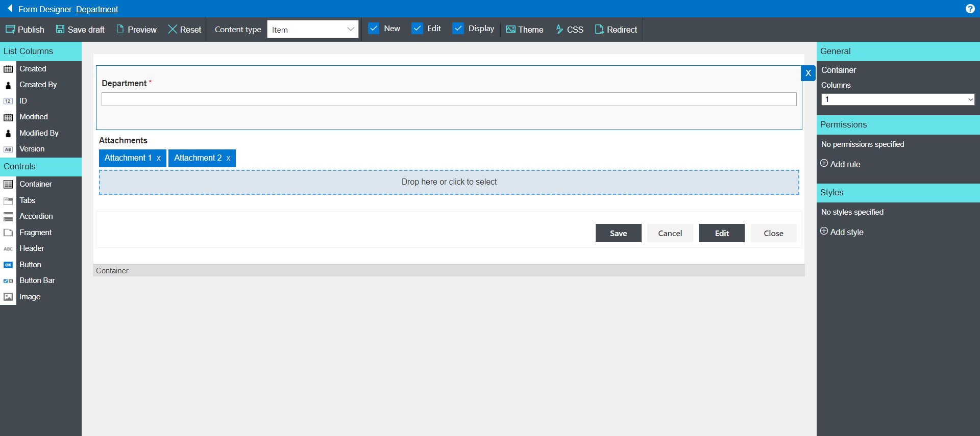
Personally, I think this is terrific. In addition to the usual controls over look and feel, the modern Form designer gives you all the other tools you need, too.
And, because of the Form designer’s nested structure, you can apply permissions around visibility and different levels – showing or hiding entire sections, tabs or individual fields as is needed.

I also find the new interface very easy to work with, although I’ll admit that I had a learning curve to get over.

There is one place where you need to be a little careful. Since the form can contain multiple nested containers, it’s pretty important that you select the right one when you’re making changes – especially with permissions. There has been more than one occasion when I’ve made changes only to find that I’ve hidden an entire container rather than a single tab or a single field … hey, none of us are perfect, OK? The good news is that it takes just a minute to fix the problem and republish the form.
Overall, the new UI provides a quicker, cleaner, and more logical approach to the whole process of form building and control.
