Introduction
As you know, Form Designer component of Ultimate Forms is a fantastic tool for creating flexible, smart and dynamic forms for your SharePoint lists and document libraries. But are you familiar with all the different styling options it offers? You can create amazing looking forms, exactly the way you want them, with minimal investment of time and next to no knowledge and experience!
This blog introduces and describes the variety of styling features provided, giving you the knowledge you need to build great looking forms!
Themes
The easiest, albeit the most limited option. All you do is select from a the various theme we already built for you. You just pick and click, that's all.
Let's say we started with this vanila form:
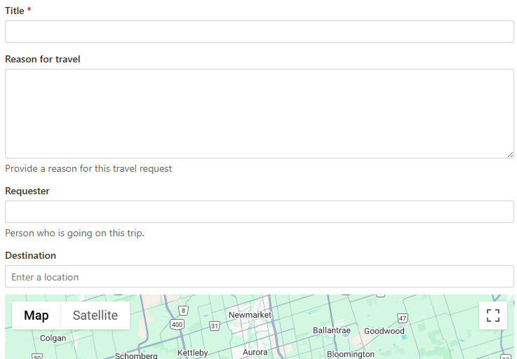
By simply going into Styles -> Theme, you can view and select a theme you like.
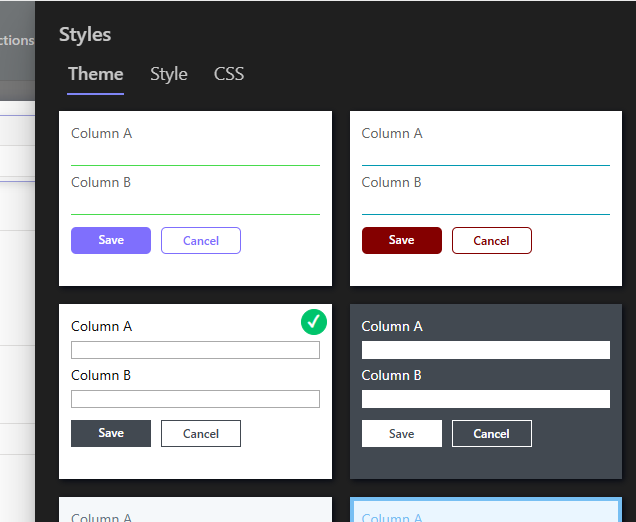
Just publish the form and you're done!
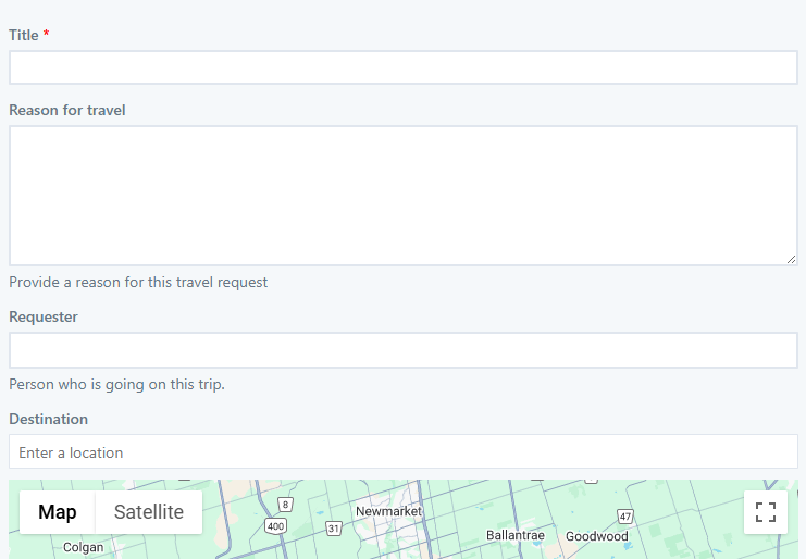
There is nothing to configure here, so it might not be the right choice when you need to produce a very specific design. But it's great for simple forms that you just want to jazz up a bit.
Style
Located under Styles -> Style, here you can find most common configuration options presented in a simple and user-friendly way, without requiring any particular knowledge.
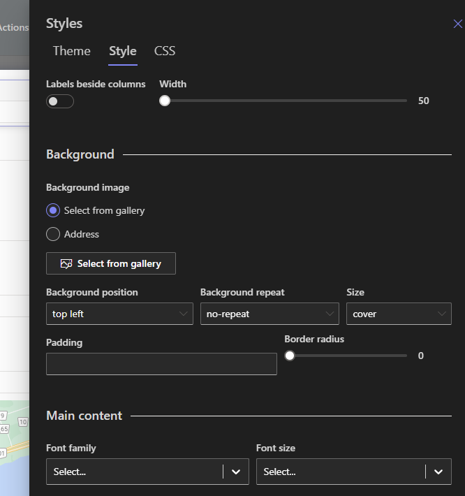
The screen is divided into sections:
- Background - the main background of the whole form, it's a good place to put a background image.
- Main content - the main block where the actual content of the form resides (columns, headers, tabs, etc.). You can configure its background color and transparency, padding, rounded edges, drop shadow and main font to use.
- Controls - here you can define how your data entry control look like. You can set font type and size, borders, background and foreground colors and shadows.
For the background image, you can select one from the gallery of royalty-free images we provide, or you can create and manage your own gallery under Organization.
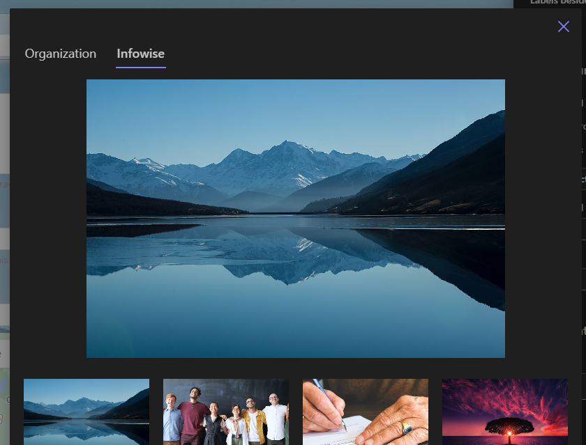
One common implementation would be selecting an image and then placing a semi-transparent main content background on top of it.
The ability to style controls is a brand-new feature we just released. It applies to all controls on the form at once, making it easy to achieve consistent, unique look.
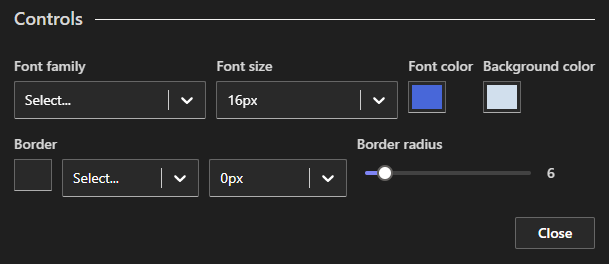
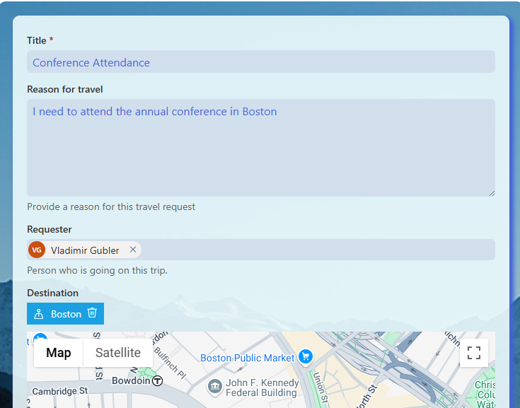
As you can see here, I enlarged the font, introduced background and text color, made the corners visibly rounded and removed the existing borders by setting their width to 0.
And here is the result:
Dynamic Styles
So far we discussed ways of styling the form as a whole. But what if you want to emphasize just a single element on the form? You can easily do that as well! And as an added bonus, you can apply those styling rules dynamically, according to the values being entered by the user.
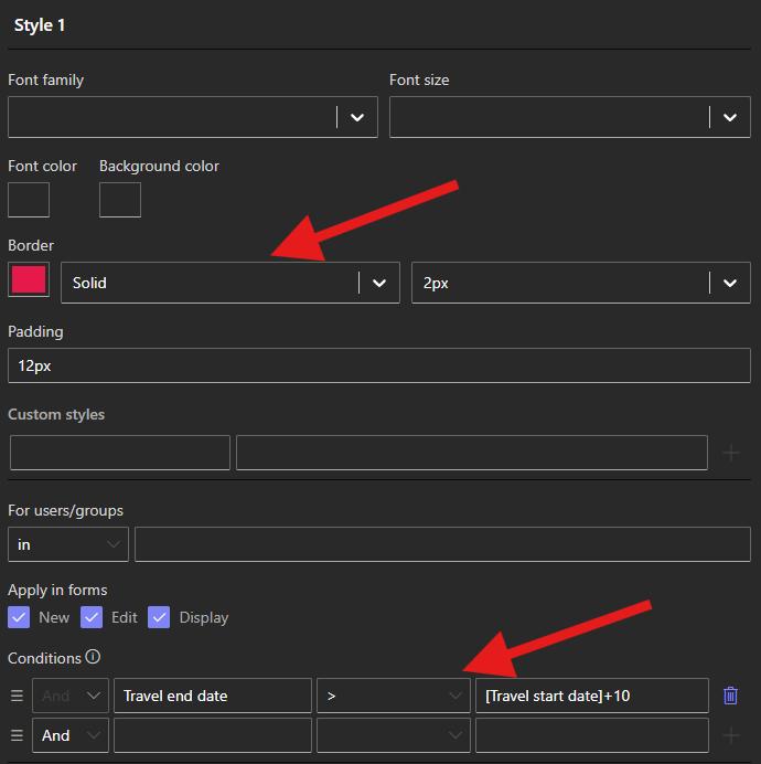
Here I'm adding a red border and some padding when the period on my travel form exceeds 10 days. Look how easy it is!

And now something for the experts...
What if you need to achieve something so unique, all of the abovementioned methods just don't cut it? We make it easy to add custom CSS as well!
You can for example specify your own CSS class name for any element on the form, such as a control:
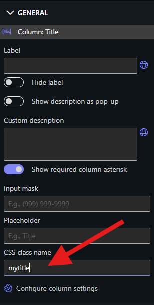
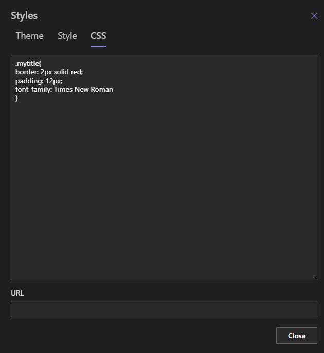
Then under Styles -> CSS you can define this class any way you want. You can even define your own classes and styles in a separate CSS file, upload to a document library somewhere and link to one or more forms!
For instance here I defined a unique look for the control:

In conclusion, as you can see, it's easy to style your forms with plenty of options to choose from. Just use your imagination! And the most amazing thing is that you can combine all of the methods: just pick a theme and augment it with some of your own styles for a unique look that is fast and easy to achieve.
