Hi,
Ultimate Forms' Form Designer is a fantastic tool for creating advanced, responsive modern forms in SharePoint (both online and on premises). Although simple and intuitive at the first glance, it is actually loaded with features that help you implement advanced, multi-stage business solutions directly in your browser, without any programming and, in most cases, without the need for complex workflows.
In this article I will focus on the layout and styling part of the form design, without delving into rules or business logic. Let me show you how you can create great looking forms that will work equally well, no matter what type of device you are using.
When you first open Form Designer, you will see that the main section of the screen is divided into three parts:
- Design canvas - the largest part in the center. This is where you drag your columns and other components and visually design your form.
- Left pane - here is your toolbox. All the columns in the list are there, waiting to be dragged onto the canvas. You will also see a selection of components, such as buttons or tabs.
- Properties pane - this is where modify your column/component settings and add business logic rules.
Let's focus on the components first. First of all you will notice there is no table control. If you used to work with other form designers in the past, you are probably used to having to build a table-based grid and and placing your columns, labels and buttons within the cells of that grid. And now you should forget all about that! That's the old way of doing things and it resulted in rigid forms that where tightly tied to a specific device type (usually desktop) and looked horrible when viewed on a phone. In addition, this approach was a pain to use and required long and meticulous adjustments, setting pixel-level dimensions and generally wasting your time on something that computers are much better at than humans.
Meet your new best friend, the humble Container! This little component will make creating sophisticated forms so much easier. As its name indicates, the container simply contains other columns/components within itself and controls their layout on the page. You can configure the container to display its child components vertically or lay them out side-by-side in 2 or more layout columns. Because containers are responsive by design, they will automatically adjust their content according to the device. So the same container will display 3 columns side-by-side on the desktop, 2 on a tablet and arrange them all vertically on the phone. No need to mess around with device-specific forms, no need to adjust width or add device-specific CSS.
And because containers can hold other containers within them, it opens up unlimited design possibilities. For example, you can have one container with 2 layout columns and place another container with 2 layout columns within it. So now you divided the screen into 3 parts, half and two quarters! You can nest the containers as much and as deep as you need. Bear in mind that you can assign style and permission rules to anything on the form, including containers, so now you can create a fully dynamic form in minutes!
Now let's talk about styling. There are several styling options that we have intergated into Form Designer, you will use the one you want for each partcular form (or a combination or 2 or more).
- No styling - the form will already look great without any additional styling. It will simply take the styling from your site and just blend in. That's the easiest and most common approach
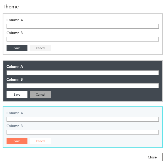
- Themes - we currently support 3 themes (and additional 3 themes just for tabs and accordions). Themes control the general color scheme of the form.

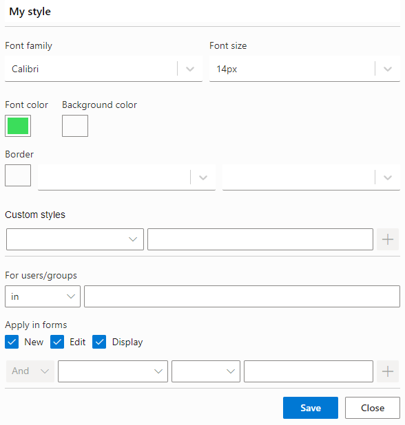
- Style rules - you can apply specific style rules to any column/component. You can control things like font, color, background color, border and much more. Style rules can also be conditional and maybe be applied only for specific users or under specific conditions.

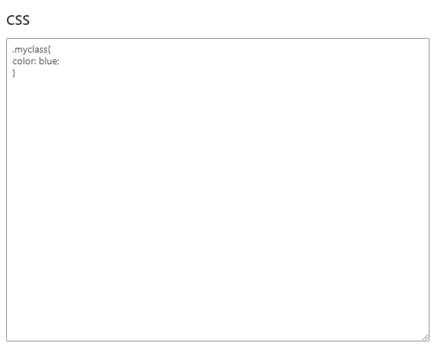
- CSS classes - add your own custom CSS classes to the whole form, overriding the default classes. You can assign a custom class name to any column/component to target it through your CSS classes. It's a more advanced option, that requires some knowledge of how CSS works. F12 is your best friend here.

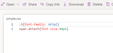
- CSS file - you can create a CSS file, place it in a document library (or on CDN) and reference it from all your forms. This is the best solution when trying to apply some sort of uniform look and feel in your organization. Again, you can specify custom class names for your components (basically anything you want, just no spaces) and target them through the CSS file.

Just to illustrate how an external CSS file would work like, this is my simple file's content:

Once I add it to the form, it overrides the way file attachments look like (making them look huge, for no particular reason):

As you can see, there are a lot of options to choose from. Try and see what works best for you in each particular case and, most importantly, have fun doing it!
