Introduction
In the previous blog, we covered the integration of Power Apps with Infowise Ultimate Forms data and the foundational steps to create a functional dashboard. Now, we’ll focus on designing a user-friendly dashboard.
The dashboard must be simple, intuitive, and visually engaging to cater to a non-developer audience. It must also ensure that users can track processes easily and make decisions efficiently. In this post, we’ll walk through designing a candidate progression dashboard in Power Apps, inspired by familiar tools.
Why Focus on User-Friendly Design?
The target audience for this dashboard includes non-technical users who expect straightforward navigation and clear data presentation. The design should allow HR managers and business owners to quickly access relevant candidate information, see the status of their recruitment process, and make informed decisions with minimal clicks.
Steps to Design an Intuitive Power Apps Dashboard
Choose the Right Layout for Candidate Progression
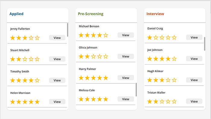
In this scenario, the dashboard is intended to display the progression of candidates through different stages in the recruitment process. The design will be similar to a Kanban-style board, with cards representing candidates at each stage. The stages can be labeled as follows:
- Applied
- Pre-Screening
- Interview
Each stage will show candidate cards with their names, initials, rating stars, and an option to view further details. This layout makes it easy to visually track each candidate’s journey in the hiring process.
How to Implement in Power Apps:
- Create a Gallery Control for each stage (e.g., Applied, Pre-Screening).
- Populate the gallery items from your SharePoint list, using columns like “Candidate Name,” “Stage,” “Rating,” or any other columns according to your preference.
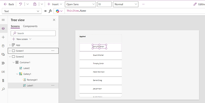
For each stage, use a separate gallery filtered by the "Stage" column in your SharePoint data. Display relevant candidate details according to your preferences and needs.
Add Candidate Information to Each Card
Each candidate's card will show key information in a compact format:
- Profile Picture: If available, display their profile picture.
- Name: Display the full name prominently on the card.
- Rating System: Show star ratings for easy qualification of candidates, based on factors like skills, experience, and education. This can help users quickly gauge which candidates are most qualified for the next stage.
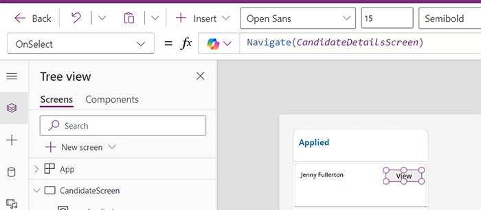
- View Button: Add a View button on each card so users can click to see the full candidate profile, including resume, interview notes, or any additional documentation.
How to Implement in Power Apps:
- Add a Button Control from with the text "View" and set it to navigate to a detailed candidate profile screen:
Implement Drag-and-Drop Functionality (Optional)
While Power Apps doesn’t support drag-and-drop natively, you can create a simulated experience by using buttons or dropdowns that allow users to update the candidate’s stage (e.g., from "Applied" to "Pre-Screening"). This helps HR managers move candidates between stages as they progress through the hiring process.
Example:
- Add an Update Stage button on each card that allows users to update the candidate’s status, with options like "Move to Interview."
- Once clicked, it triggers an update to the SharePoint list.
Use Clear Visual Cues and Accessibility Features
To make the dashboard even more user-friendly:
- Color-Coded Stages: Assign different background colors to each stage (e.g., light blue for Applied, green for Pre-Screening) to provide visual separation and clarity.
- Star Ratings: Make sure the star ratings are clear and intuitive, with an option for the user to rate or update the rating as the candidate progresses through interviews.
- Responsive Design: Ensure the dashboard is accessible across devices. Test the layout on both desktop and mobile to ensure it adapts well to different screen sizes.
Test the Dashboard with Your Target Audience
Once you’ve set up the dashboard with stages, cards, and navigation buttons, it’s important to test it with your intended users—HR managers and business owners. Ensure the layout feels intuitive, and that users can easily move through stages and access detailed candidate profiles.
Final Thoughts
Designing a candidate progression dashboard in Power Apps, integrated with Infowise Ultimate Forms, can greatly improve the hiring process for HR managers and business owners. By following the steps outlined above, you can create a dashboard that is visually appealing, easy to navigate, and effective in managing the recruitment workflow.
In our next post, we will explore adding filters, and more functionality, enabling users to drill down into specific data sets and customize their dashboard view even further.
Add your comment
Flexible Forms
Intuitive Automation
Clear Reporting
100’s of Templates
