Hi,
In any business solution based on SharePoint, the first and most important part is always the forms. This is what the user sees first. A smart, well-designed form will ensure that complete and correct information is entered. A great form is clear, leaving no room for confusion, leading and assisting the users through the data entry process.
Form Designer in Ultimate Forms was created specifically for this purpose. Simple and intuitive to use, it packs a ton of features that result in great looking, smart and dynamic forms your users will love.
Today I want to highlight some of the most powerful and commonly used capabilities. I'm using the example of a simple support ticket management system.
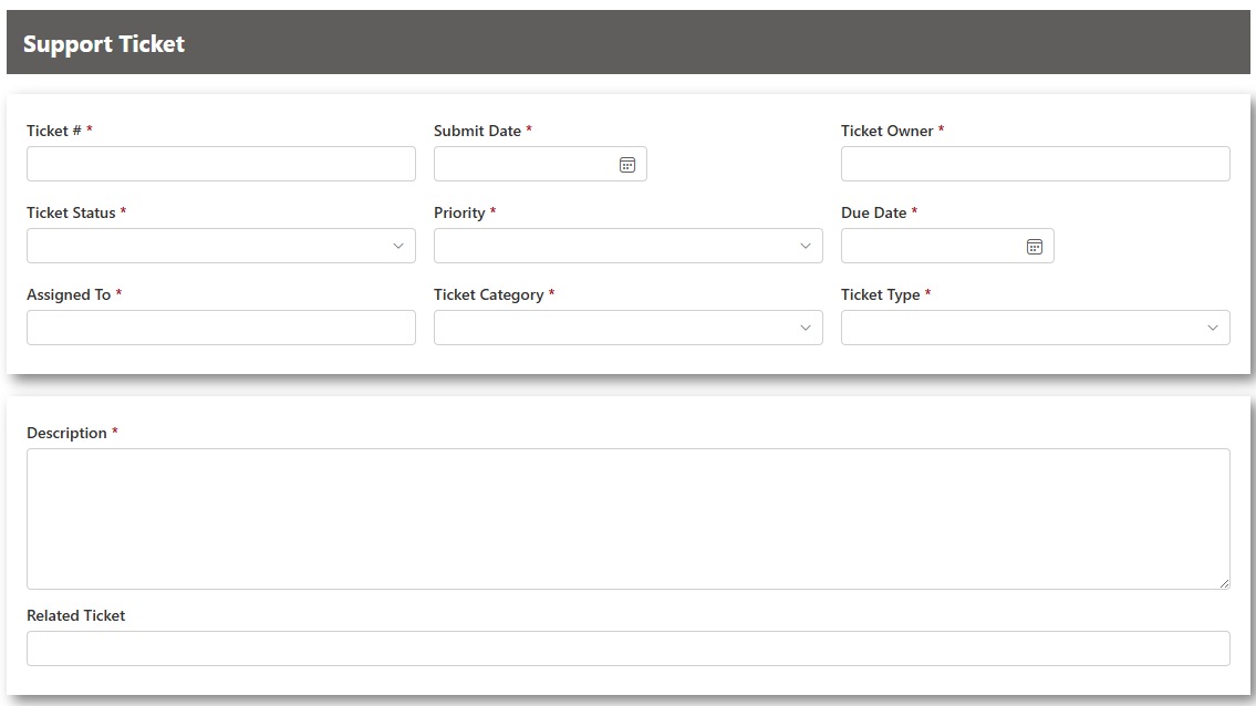
Form Layout
First of all, let's talk about the layout of the form itself. I'm not going to be covering the many styling options Ultimate Forms offers, as those were covered in my previous blog. Today we'll be focusing on defining the placement of various elements on the form, making certain elements visible only under certain conditions, as well as enriching your form with dynamic rules and validations.
The first visual element I want to talk about is the mighty Container.
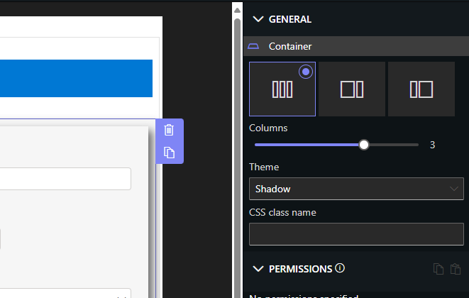
Using containers, you can accomplish a varierty of layout tasks. You will use it to arrange the position of other elements (such as column controls), to apply permissions to a group of columns all together and to add styles and themes to the form. The container is the first element you want to master when starting to work with Ultimate Forms.
Containers control how the included controls are arranged on the page. Unlike some other tools, there is no rigid grid involved and you don't need to waste time aligning and worrying about how the form will look on devices of different screen sizes. All that is automatically handled by the containers!
You simply define how many layout columns your container should have, then drag other elements (including other containers!) inside. They will be automatically laid out and made responsive. So for example, three elements across will be placed one above the other on a mobile device with a smaller screen, saving you the time of creating separate layouts for each device type.
You can either select one to four columns across or choose 33% / 66% or 66% / 33% division. Once you've decided on the layout, you can also apply one of the themes containers offer. Or you can select no theme and just use the container for layout purposes only.
You can see here how I managed to place two columns side by side and the third one below at the full width of the form by nesting containers:
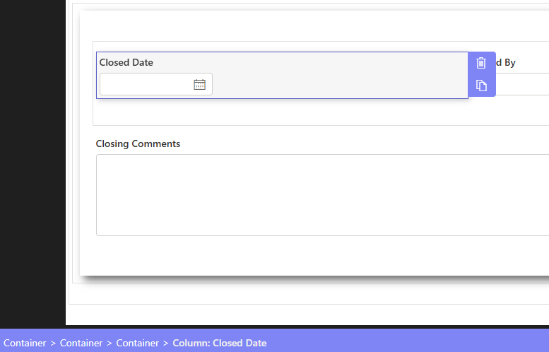
The outer container places all its elements in one vertical column. It contains another container and the column "Closing Comments". The inner container places its controls side by side. It's really that simple!
Permission Rules
Another extremely important feature common to all controls are the permission rules. Those can make elements hidden or visible, and, in the case of columns, also read-only or writeable. Contrainers and other container-like controls (such as tabs) will push their rules down towards the controls they contain, unless overriden at a lower level. This way you can make a whole section only appear when needed. For example here, the resolution details are only visible when the status is set to Resolved, using a simple permission rule.
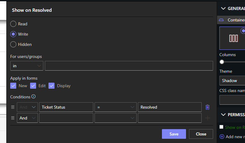
When you first create a ticket, this section is hidden. But once you change the status to Resolved, it will dynamically appear right away.
As I said, permission rules can be applied to any element, for example directly to a column.
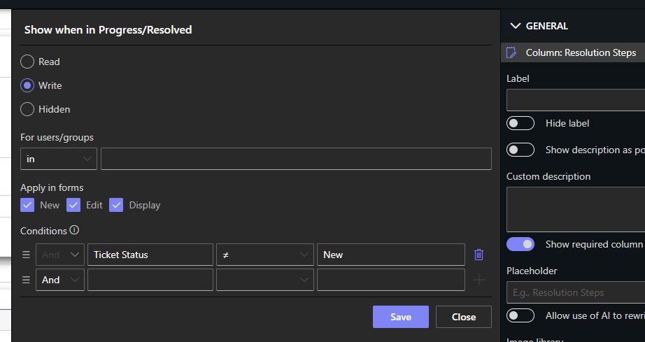
Once we publish the form, enter a new ticket and change the Status to Resolved:

The closing details section will appear below. It's just that simple.

Note that I didn't need to create a second rule for Hidden. It's implied when creating the Write rule. Anything not covered by any other rules is automatically Hidden (unless there are no rules at all).
Dynamic Rules
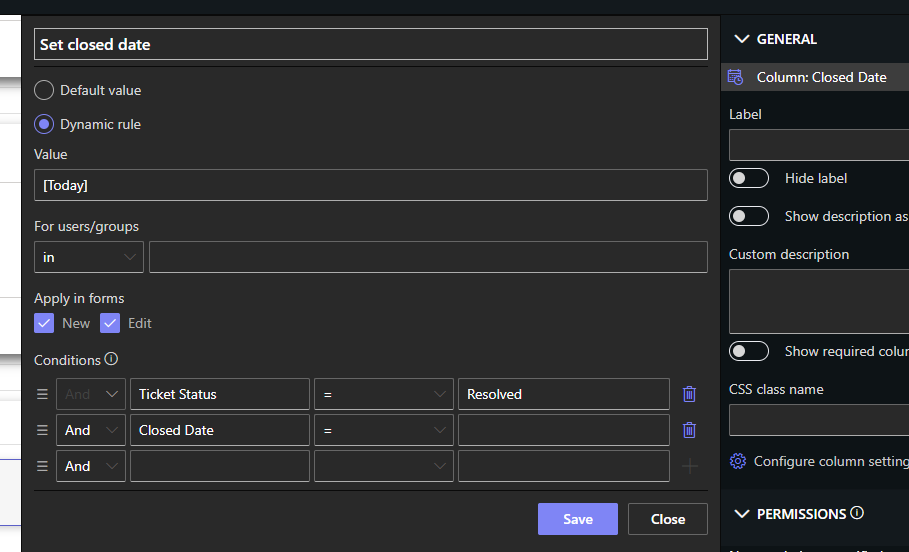
In addition to permissions, we can use dynamic rules to automatically fill out column values when, for instance, other columns are changed by users. Here for example we fill out Closed Date with today's date when the Status is changed to Resolved. We can even combine dynamic rules with permissions not to allow users to change the automatically assigned value.
Validation Rules
Ensuring proper information is entered into the form is crucial. That's why Ultimate Forms offers a variety of features to ensure valid data entry, as well as to make validation errors stand out.
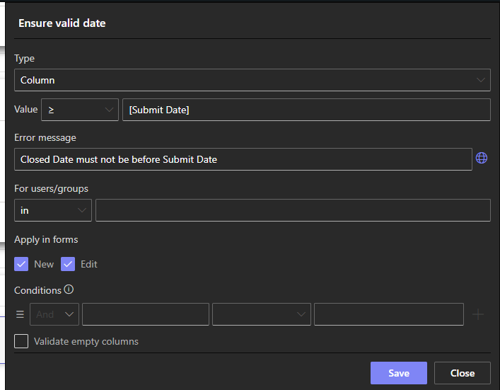
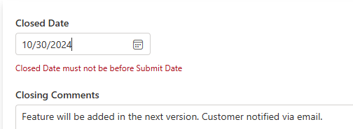
Here we are ensuring that the Closed Date is never earlier than the Submit Date of the ticket. You can provide your own error message (that can also optionally be in different languages, depending on the preferred language of the current user).
The error will appear right under the column:
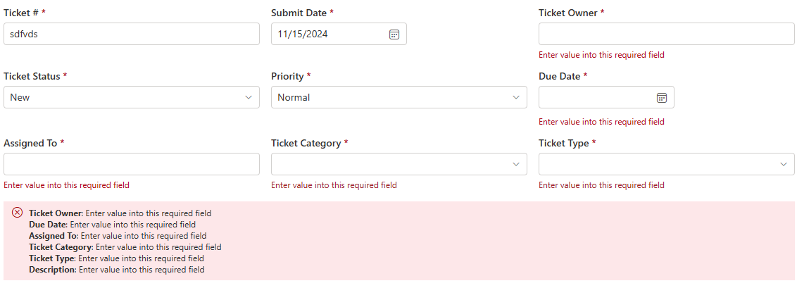
If you are designing a large form and want to make it easier for the users to know there were errors without having to go over the entire form, you can place one or more Validation Summary controls.

Those will combine all the validation errors of all the controls in the same container (or the whole form when placed outside of any containers).
Button Bar
Another very useful control is the Button Bar. As its name suggests, it's a bar that contains buttons. In addition to being able to control the position of the buttons on the form, it is also responsible for showing and hiding the relevant buttons based on the form type.
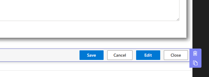
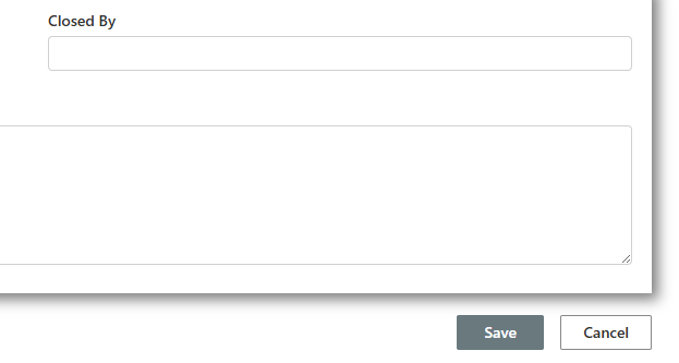
So for Edit form you will see Save and Cancel buttons, whereas for Display form you will see Edit and Close. You don't need to add any rules, it is done for you for the button bar itself.
Tabs and Accordion
An alternative to just placing containers one above the other on the page, you can use tabs or accordions to group controls together. This way only certain controls are shown whenever the tab is visible, making the form more compact and easier to use.

As with containers, each tab can have its own permission rules, making your form dynamic. The decision what to use is yours, you can also mix and match different approaches. For example, some controls could be on their own, while others set inside tabs.
And to sum it up...
Today we just covered some of the great features of the Forms component of Ultimates Forms, there is so much more that is available (did anyone say repeating sections?). Explore on your own and build great looking, highly functional forms!
