Multiple Columns (Classic)
There are some cases where multiple columns should be used in a layout.
In the General Settings area, you may select for the fields to use multiple columns.
In most cases, a single column is the most apprpriate and easiest option.
In situations where there are many fields or if fields may be logically paired it can create a better user experience to use more than one column (such as paired start value and end value.)
NOTE: This tutorial demonstrates the older method of creating custom Forms in Ultimate Forms. This method is appropriate to use with the SharePoint Classic experience; if you are using the Modern Experience, our recommendation is that you use the Modern Form designer instead.
Instructions
- First, let's take a look at what happens when the columns are switched from 1 to 2 columns in General Settings:
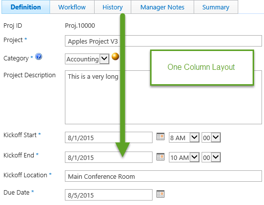
- Normally the columns are always stacked vertically:

- When the column count is switched to 2 columns notice how the fields are rearranged:

- The columns are arranged left to right with each second field in the right column.
- In order to provide breaks between sections and control the location of fields, additional tools can be applied.
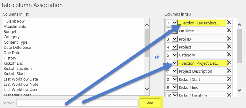
- Use the Section header option under Tab Column Association to control the location of fields and line breaks:

- Consider how the above changes change the layout of the two column form:

The Blank Row option can also be applied to control field location and spacing.
Summary
Multi-column layouts may be useful in cases where there are many fields that must be included in the form or when there are pairs of matched fields that show a related value between fields. These layouts should be used sparingly so as not to overwhelm the user with a wall of text and overwhelming information.