Range Column Chart
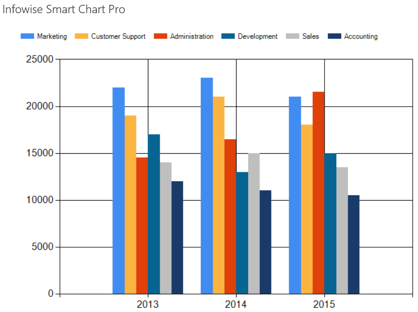
A Range Column chart is useful in comparing many series of data side by side. WIth this chart, changing the 3D setting has a distinctyly different effect.
In this example, we compare the spending between departments on a year to year basis:

Instructions
- Begin by creating a new list that is appropriate for the chart type.
- Create a list called Deparmental Spending.
- Change the Title column to Year.
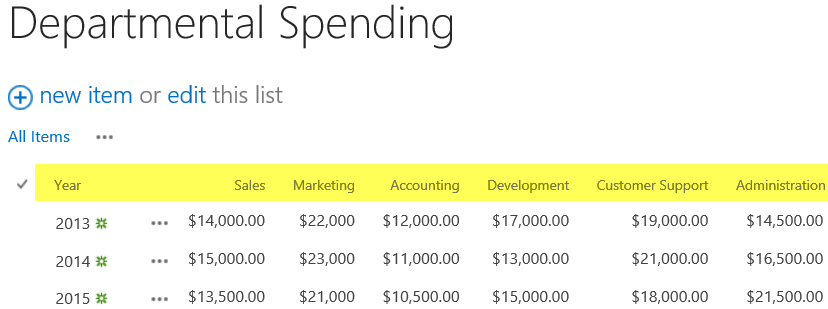
- Add currency columns for Sales, Marketing, Accounting, Development, Customer Support and Administration.
- Add test data as shown:

- Create a new page Departental Spending Chart.
- Add a Smart Chart web part as described in the Column Chart section.
- Use a large size of 500px height and 700px width.
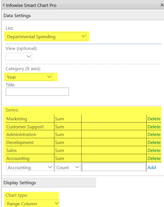
- Choose the Range Column Chart type as shown.
- Include each of the departments as a series in the chart.

- Your chart output will look similar to above.
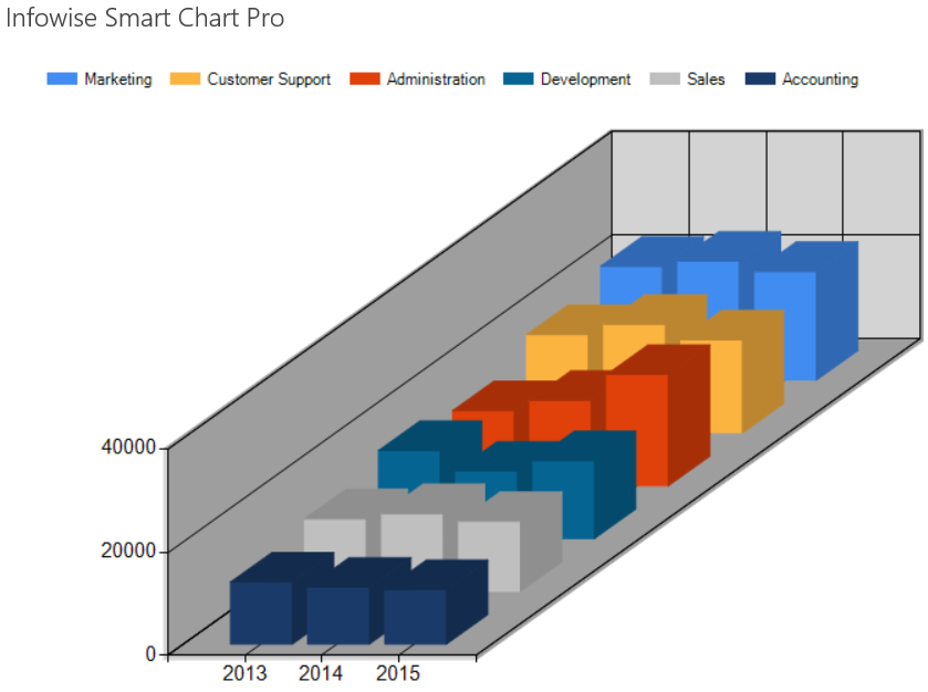
- Try turning on the 3D setting for a dramatically different chart.

Summary
Range Column is a good choice when examining the values for many fields in a list over time. Making use of the 3D settings produces a dramatically different chart.
Last modified: 4/29/2025 8:54 PM