Point Chart
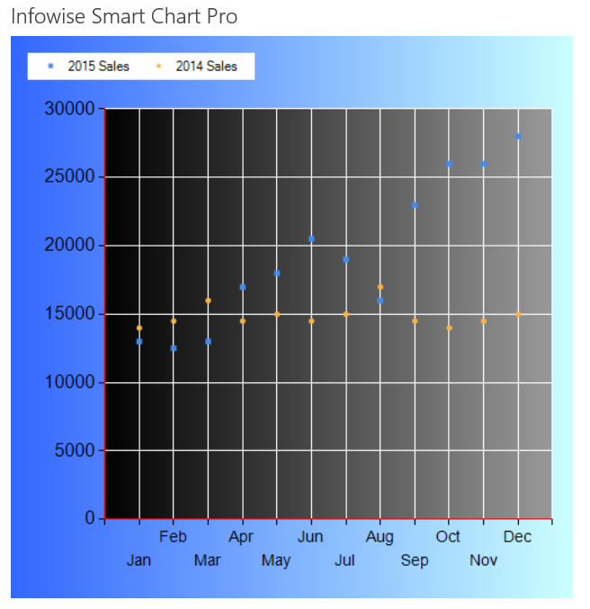
A Point Chart can be used for plotting multiple series of data. This is very much the same as a Line Chart except that the data points are not connected with lines. This may be helpful in situations where there are many points of data being plotted in one chart. Using some additional settings can make the chart look more visually appealing as shown:

Instructions
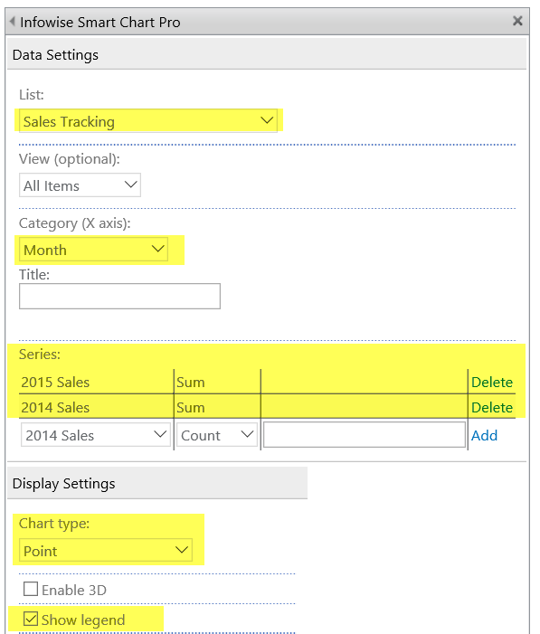
- Use the same data from the Column Chart.
- Use both 2014 Sales and 2015 Sales as shown.
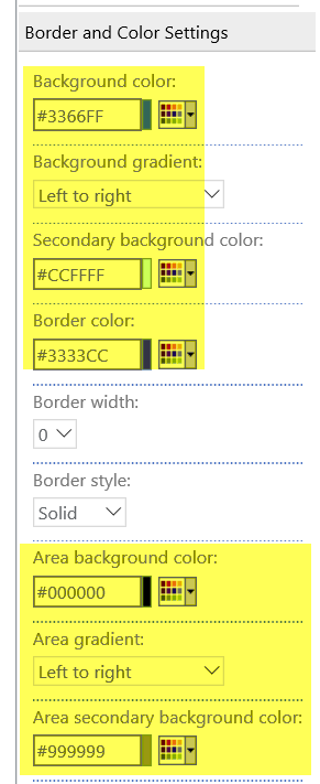
- Apply additional settings to apply a grid and background gradients.

- Enable grid settings:

- Adjust gradient colors as shown.
- There are two sets of gradients - one for the chart background and one for the chart area background.

Summary
A Point Chart is not inherantly appealing with default settings. Applying some additional formatting can make this chart stand out. Consider this type of chart when plotting a large amount of data including multiple series.
Last modified: 4/29/2025 8:54 PM