Funnel Chart
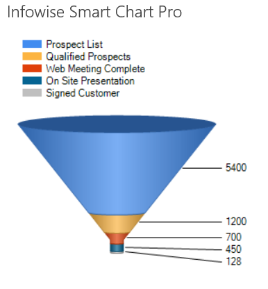
A Funnel Chart is often used to show a reductive process in which there are smaller quantities over the progression of a process. In particular this is useful for sales data. Consider this chart which indicates the progression from prospective customers to converted sales:

Instructions
- Begin by creating appropriate list data for a Funnel Chart.
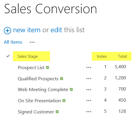
- Create a new custom list using Sales Stage, Index and Total columns.
- Rename the Title column to Sales Stage for this list.
- Add in some test data similar to below in which the values decrease for each successive record.

- Create a new SharePoint wiki page called Sales Conversion Chart.
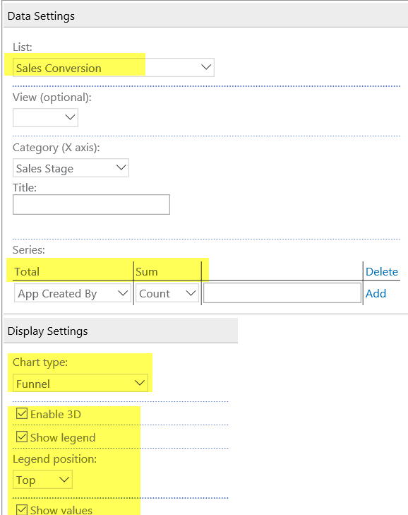
- Add in a Smart Chart web part as described on the Column Chart page.
- Set Sales Stage to be used for the Category.
- Use the Total column with the Sum setting for the Series.
- Use the Show Values option with this chart.

Summary
A Funnel Chart typically only fits a very specific type of data set. Consider this type of chart when demonstrating progression toward a goal via a process of elimination.
Last modified: 4/29/2025 8:53 PM